The design is very important for every website. Often, theme development takes more time than programming. In this article, I would like to describe step by step process of theme development for Drupal.
I will not describe the difference between Drupal 8 and 7 theming, as this article is intended for beginners in Drupal, and those who worked with Drupal 7 before will see the difference anyway.
Preparation
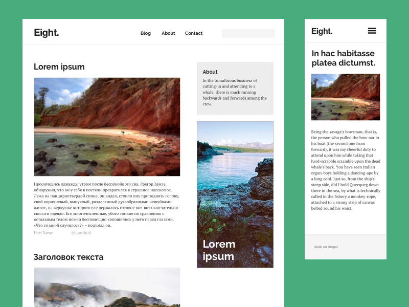
I've quickly drawn the theme design in Sketch. It is a simple blog with right sidebar. Nothing complicated. You can see the mock-ups below.
First, we will need to:
- Install Drupal 8.
- Add some content to the site or generate it by using the Devel module.
- Add blocks to the side bar (/admin/structure/block/block-content).
- Create a menu with a few links on the /admin/structure/menu/manage/main or by editing any node.
- Disable Drupal caching and twig, by following the instruction. If you don't disable caching, you would have to manually clear it each time you update the files.
We will not use Bootstrap, SASS, Grunt or any other development tools, to focus our attention on Drupal theming. I use Atom for writing the code. If you'd like to use it, you need to install the plugin for Twig syntax support.
Files structure
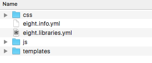
First of all, we need to create a folder for our theme in the following directory /themes/custom/. We will call it "eight", so our directory will look like this /themes/custom/eight. For Drupal to see our theme and for it to appear on Appearance page, we need to add *.info.yml file. Our file will be called eight.info.yml, and contain the following:
name: Eight
description: New theme for Drupal 8.
type: theme
core: 8.x
There we've described:
- name — theme name, as it will be shown on admin panel.
- description – description, also for admin panel
- type – here we write "theme"
- core – this is a Drupal version
After that, the theme should be available on the page /admin/appearance, but you don't need to install it just yet.

If the theme doesn't appear on the page, check if the file rights are stated correctly
Next, we add folders for the (/css) styles., javascript (/js), page templates (/templates), images (/images) and the file eight.libraries.yml. For connecting your CSS and js files you will need to describe them in eight.libraries.yml
For the content to appear on the site, you will need to create a page.html.twig file. We will place it in the templates folder. We will save all our twig files there.
Let's add one line there
{{ page.content }}
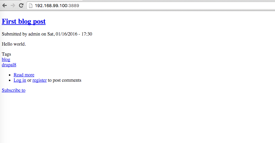
That should be enough for the content region to appear. Now we can install and set the new theme as default. If you now go to the main page, you will see added nodes without styling.
Now let's add css and js. Create style.css file in css folder. You can paste there the following:
body {
   font-size: 16px;
   font-family: 'Helvetica Neue', Helvetica, Arial, sans-serif;
   font-style: normal;
   font-weight: 400;
   background: #eee;
}
In scripts.js
(function ($, Drupal) {

  "use strict";

  Drupal.behaviors.eight = {
    attach: function (context) {

    }
  };

})(jQuery, Drupal);
Declare them in eight.libraries.yml
global-styling:
  version: VERSION
  css:
    theme:
      css/style.css: {}
  js:
    js/scripts.js: {}
That means, we've created "global-styling" library, which contains style.css and scripts.js files. Connect the library, normalize.css(Drupal already has it) and the other standard elements to info.yml
name: Eight
description: New theme for Drupal 8.
type: theme
core: 8.x
libraries:
  - eight/global-styling
  - core/normalize
  - classy/base
  - core/jquery
  - core/drupal.ajax
  - core/drupal
  - core/drupalSettings
  - core/jquery.once
Clear cache (config/development/performance) and reload the page. You can see that the font and margin have changed – that means that CSS was connected to the theme.
If the theme doesn't appear on the page, check if the files' rights are stated correctly
Markup
We have created and connected a minimum file set, now we can start with the markup. We are making a responsive design, so let's start with the mobile version. I decided to use Flexbox in the markup, as it is already supported in all browsers.
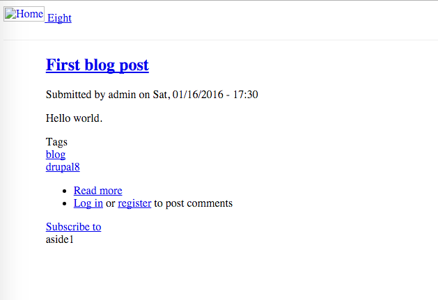
Now let's declare all site regions in the eight.info.yml. I have made a scheme of region positioning.
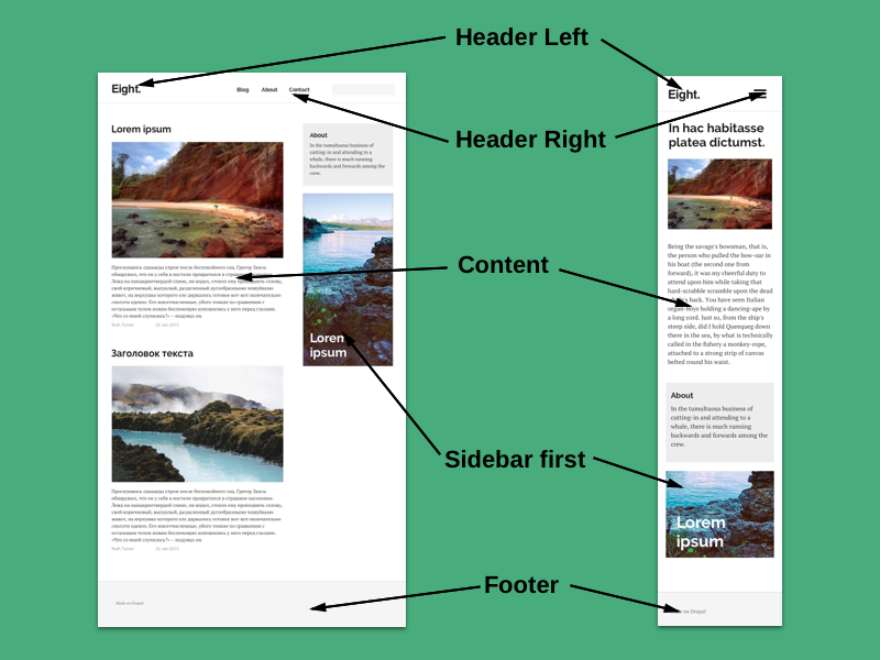
In mobile version all blocks of Header Right region, will be in one "hamburger menu", we will use a simple script for it.
List the regions in eight.info.yml
regions:
  header_left: 'Header Left'
  header_right: 'Header Right'
  content: 'Content'
  sidebar_first: 'Sidebar first'
  footer: 'Footer'
Set the blocks to display in sidebar and footer on Administration / Structure / Block layout page. For example, About block place to a Sidebar and the menu in Right Header.
Write in page.html.twig
<header>
    <div class="header">
        {{ page.header }}
    </div>
</header>
<div class="main-wrapper">
    <div class="content-column">
        {{ page.content }}
    </div>
    <div class="aside">
        aside1
    </div>
</div>
and in style.css
header {
    height: 3em;
    background: #fff;
    border-bottom: 1px solid #eee;
}
.main-container {
    display: flex;
    flex-flow: row wrap;
    margin: 0 5%;
}
.content-column,
.aside {
    flex: 1 100%;
}
Reload the page. Now you can see header and sidebar. For now, the sidebar is not on the right, but under the content, that's because we are making the mobile version first.
Add responsiveness and limit the container width.
/*Layout*/

.container {
  display: flex;
  flex-flow: row wrap;
  margin: 0 5%;
}

.content-column, .sidebar {
  flex: 1 100%;
}


@media all and (min-width: 600px) {
  .content-column { flex: 1 65%}
	   .sidebar { flex: 1 33%;
	   margin-left: 1%; }
}

@media all and (min-width: 1200px) {
   .container {
     width: 1140px;
   }
}
Now on the desktop and the tablet you can see 2 columns, on the mobile - only one. It is enough for a simple blog.
Let's add styles for the sidebar and make a date line in the article appear gray. Add the following to the style.css
/*Sidebar*/

.sidebar {
  margin-top: 2em;
}

.sidebar #block-about {
  padding: 20px;
  background: #eee;
}

.sidebar h2 {
  margin: 0;
  font-size: 1.5em;
}


/*Article */

article footer {
  color: #666;
  font-size: 14px;
}
Header and Footer
After enabling the menu, the header doesn't look good. Let's make the menu for mobile version first. Add the block with a hamburger icon to the header. Add CSS.
/* Hamburger icon */

.hamburger {
  position: relative;
  overflow: hidden;
  margin: 0;
  padding: 0;
  width: 32px;
  height: 32px;
  font-size: 0;
  text-indent: -9999px;
  appearance: none;
  box-shadow: none;
  border-radius: none;
  border: none;
  cursor: pointer;
  transition: background 0.3s;
  background: transparent;
}

.hamburger:focus {
  outline: none;
}

.hamburger span {
  display: block;
  position: absolute;
  top: 0;
  left: 0;
  right: 0;
  height: 6px;
  background: #000;
}

.hamburger span::before,
.hamburger span::after {
  position: absolute;
  display: block;
  left: 0;
  width: 100%;
  height: 6px;
  background-color: #000;
  content: "";
}

.hamburger span::before {
  top: 10px;
}

.hamburger span::after {
  bottom: -20px;
}


/*Responsive header*/

.header {
  padding: 20px 0;
}

.header--right {  /*Hide header on mobile*/
    display: none;
}

/*Menu*/

.header--right  ul {
  list-style: none;
  padding: 0;
  margin: 0;
}

.header--right  li {
  list-style: none;
}

@media only screen and (min-width: 959px) {  /*Hide menu icon on desktop */
  .hamburger {
    display: none;
  }

  .header--right {  /*Hide header on mobile*/
      display: flex;
  width: auto;
  }

  .header--right  li {
    display: inline;
    margin-left: 2em;
  }

}
And add to scripts.js:
(function ($, Drupal) {

  "use strict";

  Drupal.behaviors.eight = {
    attach: function (context) {
      $(document).ready(function() {


        $( ".hamburger" ).click(function() {
          $( ".header--right" ).slideToggle( "slow");
        });


  	  });
    }
  };

})(jQuery, Drupal);
And for the footer you only need to add CSS:
/*Footer*/

.footer {
  padding: 40px 0;
  margin-top: 40px;
background: #F5F5F5;
color: #666;
font-size: 0.9em;
}


.footer a {
  color: #999;
}
Summary
We made a very simple theme, that you can already use for your site, but many details still have to be changed to match the design. In the next article, we will finish this theme and learn more about different features of Drupal.

